Brand Identity, Stationery & Website
GTC Foods
GTC Foods is a bulk wholesale food supplier dedicated to providing high-quality food products to businesses in the food service industry. With a commitment to consistency, reliability, and excellence, GTC Foods serves restaurants, caterers, and food retailers, ensuring they receive premium ingredients in bulk quantities.
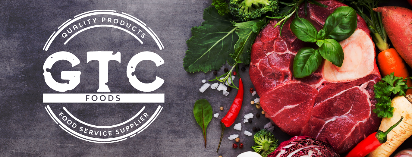
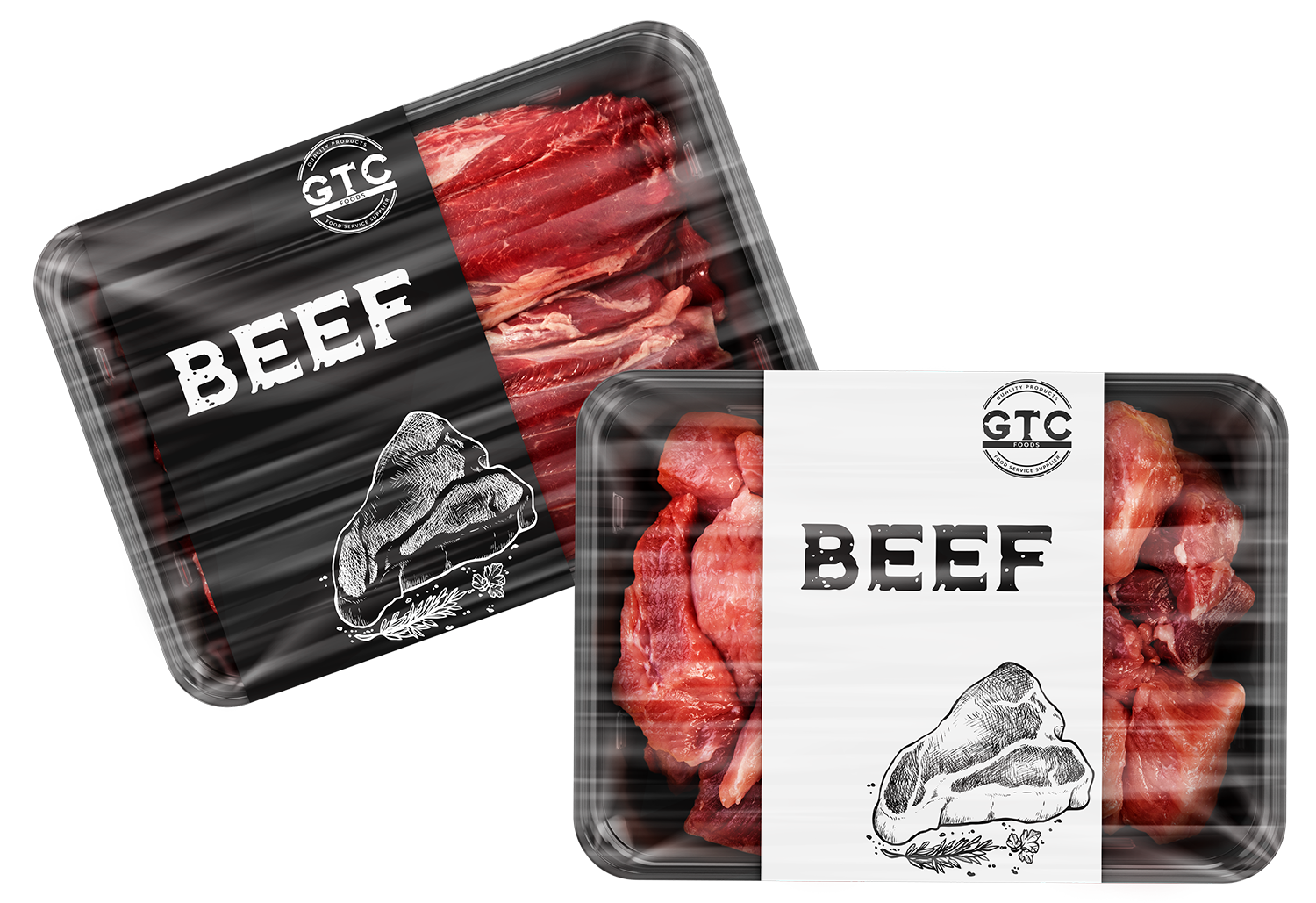
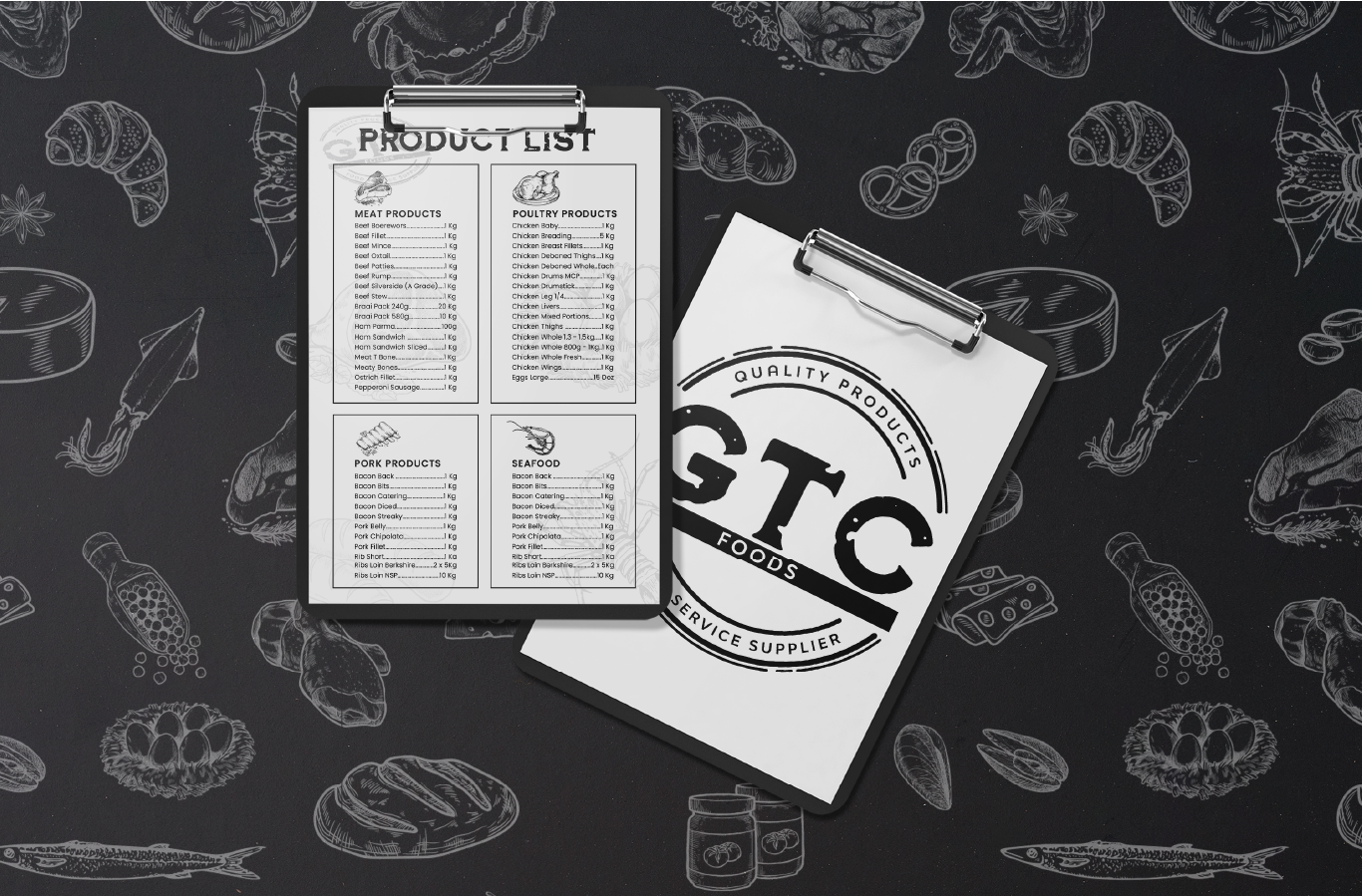
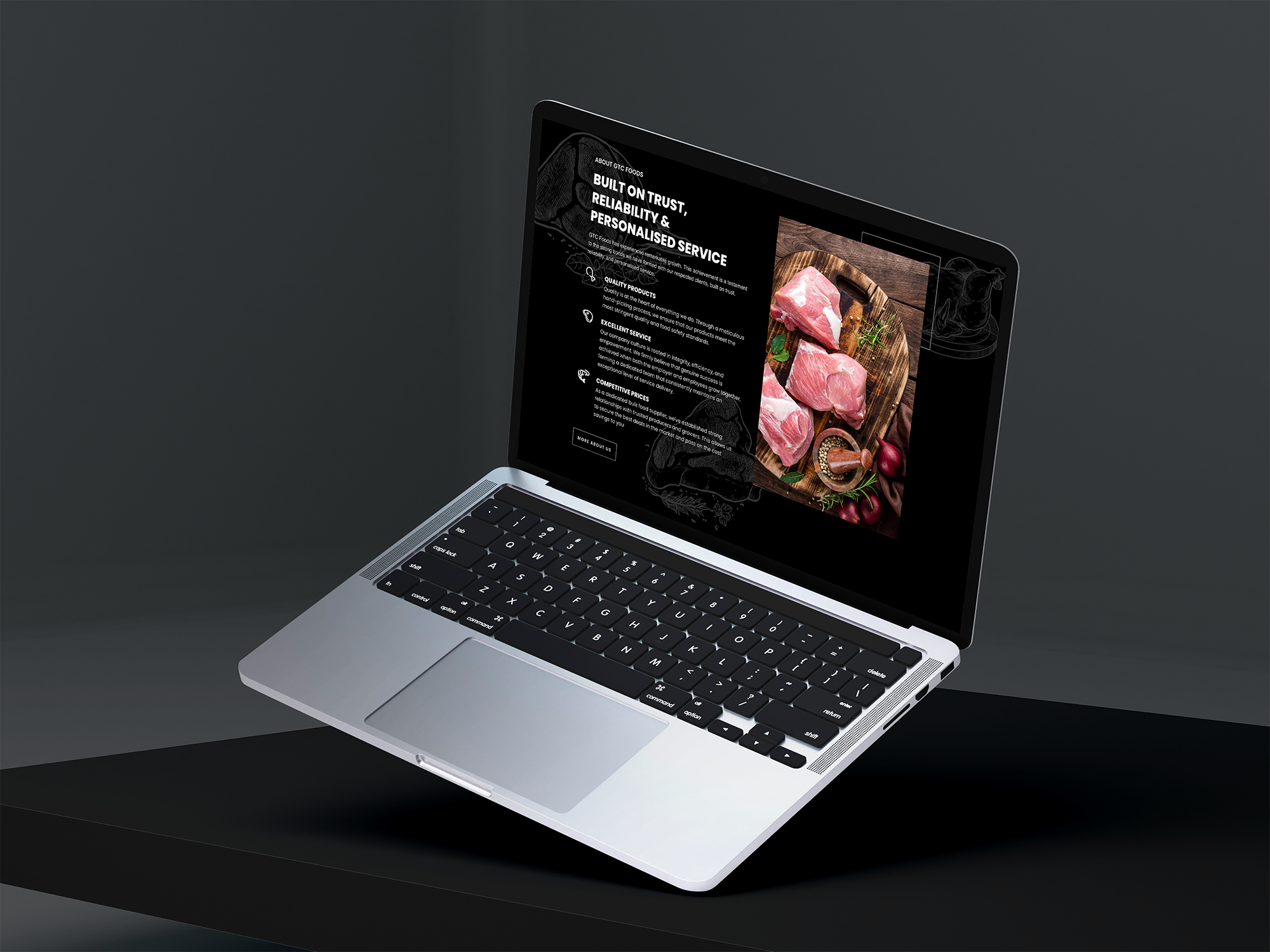
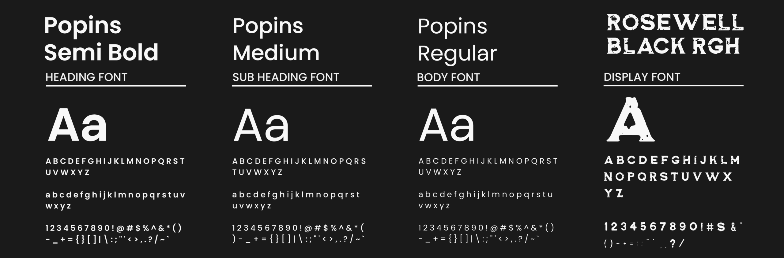
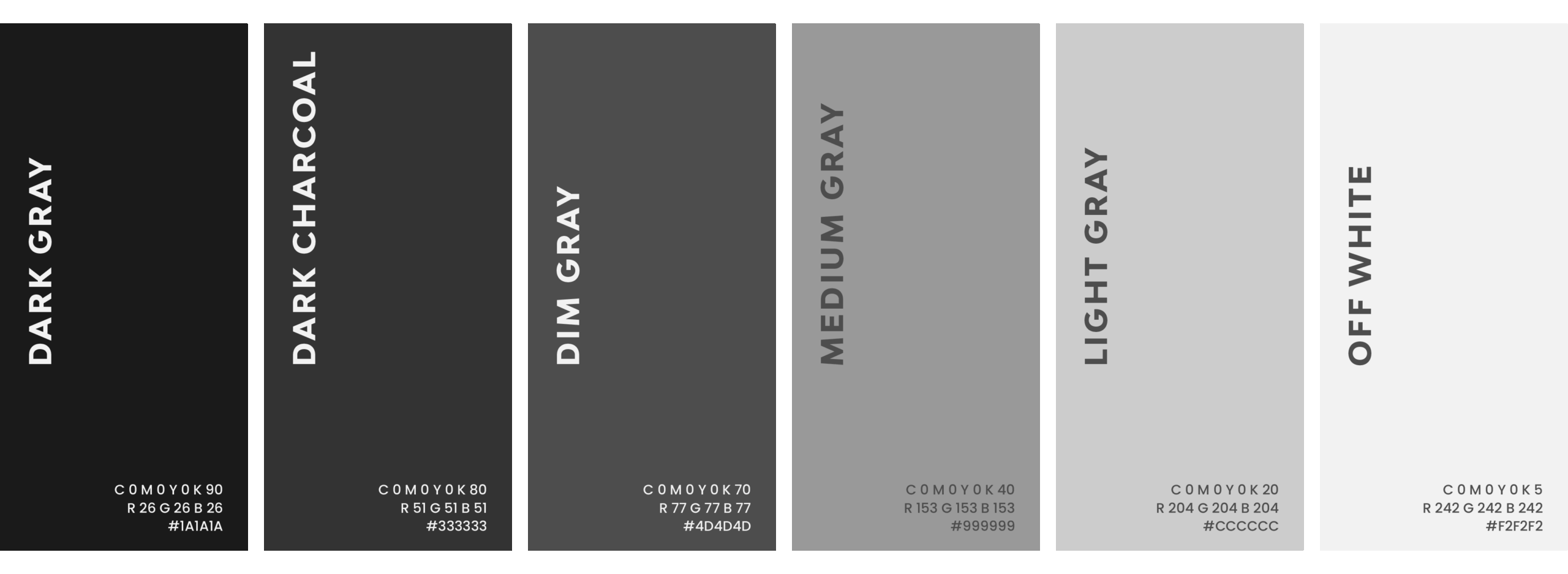
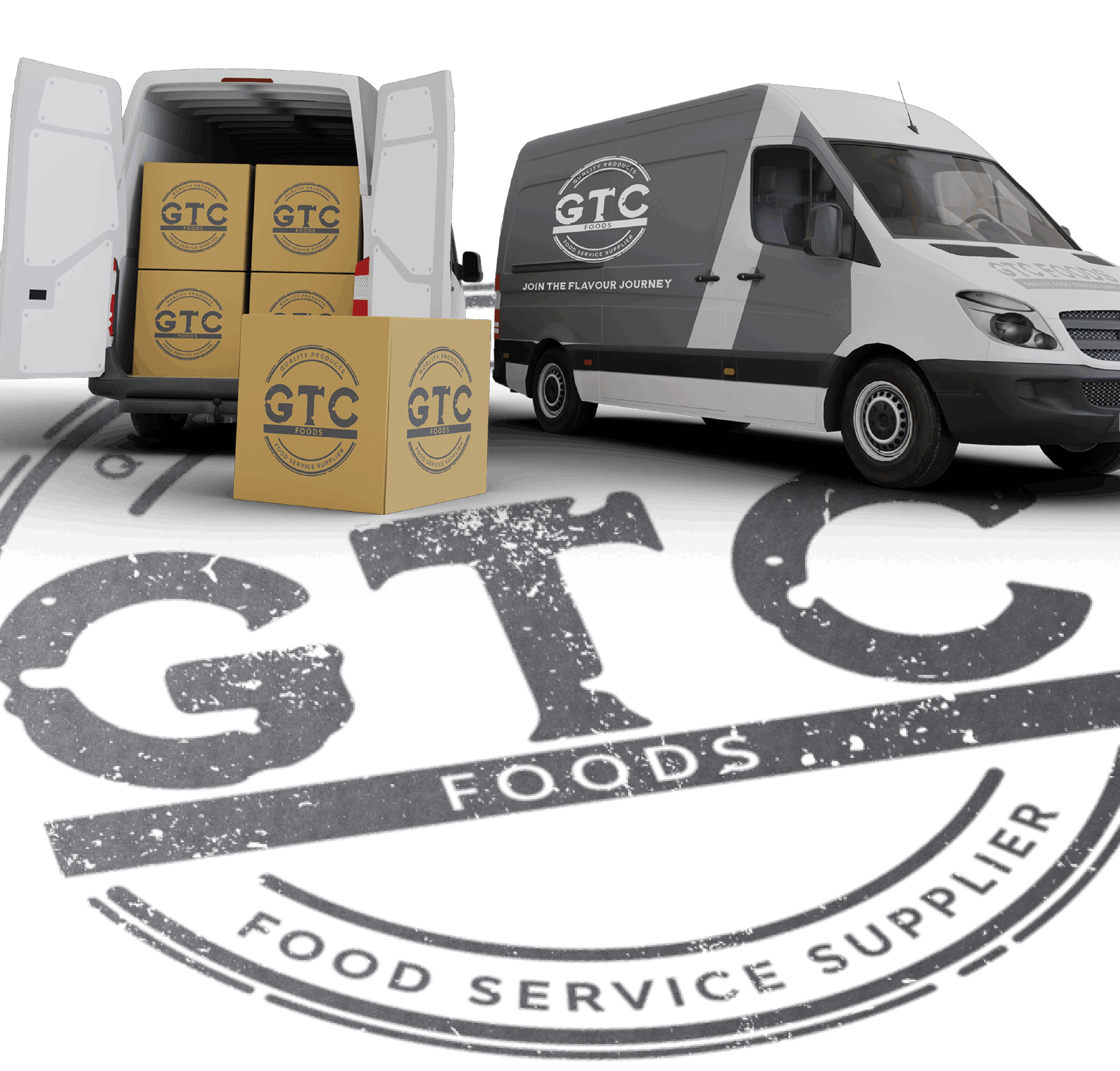
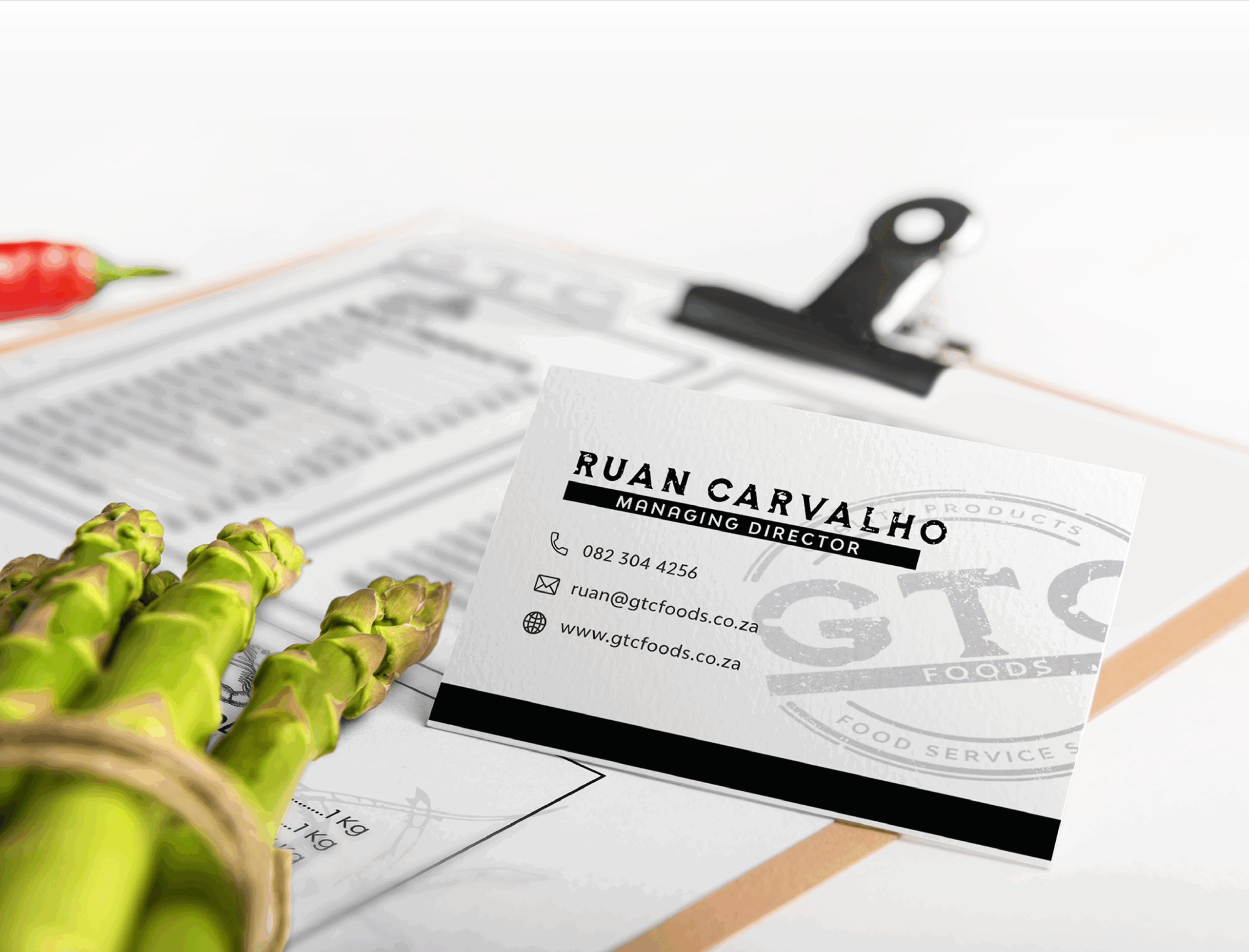
The GTC Foods brand identity is designed to reflect professionalism, quality, and reliability. The logo is bold and circular, featuring strong typography that conveys trust and stability. The black-and-white colour palette enhances versatility while maintaining a classic and high-end aesthetic. The branding extends across packaging, delivery vehicles, and corporate stationery, ensuring a cohesive and recognisable presence.
The IMPACT™ Band Strategy Framework
The messaging focuses on trust, quality, and service excellence. Key messages include “Quality Products, Reliable Supply” and “Your Trusted Food Service Supplier.” The communication style is direct, professional, and industry-focused, appealing to business owners and food service professionals.
The primary audience includes restaurants, caterers, hotels, and retailers that require consistent, high-quality food supplies. These businesses rely on GTC Foods for their bulk purchasing needs and value a supplier that prioritises efficiency and customer satisfaction.
GTC Foods competes with other bulk food wholesalers but differentiates itself through its premium product selection, strong branding, and reliable service. The bold and structured visual identity helps position the brand as a market leader rather than just another supplier.
The brand is consistently presented across various touchpoints, including packaging, delivery trucks, business cards, menus, and uniforms. The use of clean, professional layouts and strong typography ensures a unified and recognisable brand experience, reinforcing trust and quality at every customer interaction.
Making an IMPACT for our client
TESTIMONIAL
Book a Call
Ready to elevate your brand with a strategic and impactful approach? Let’s chat! Whether you need a brand refresh or a complete transformation, I’ll help you gain clarity, confidence, and a brand identity that truly reflects your business.
Book your free discovery call today and let’s make an IMPACT together!
Copyright © 2026 Lady Muse. All Rights Reserved