
Our Portfolio
Showcasing brands built for IMPACT
From brand strategy to visual identity, each project is crafted to ensure clarity, consistency, and a lasting impression.
Every brand has a story , and we help bring that story to life with strategic design and intentional creativity!
Brand Identity & Packaging
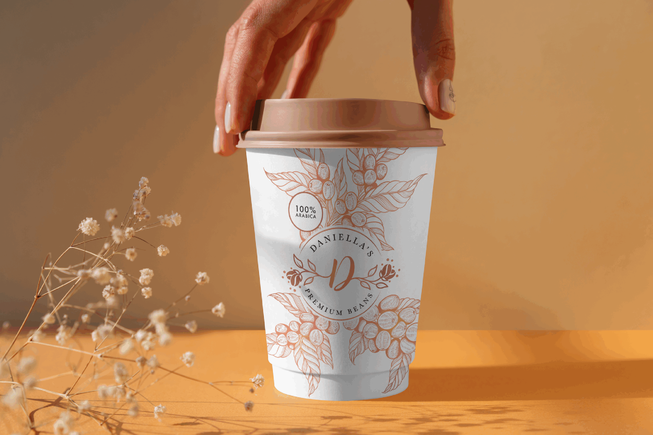
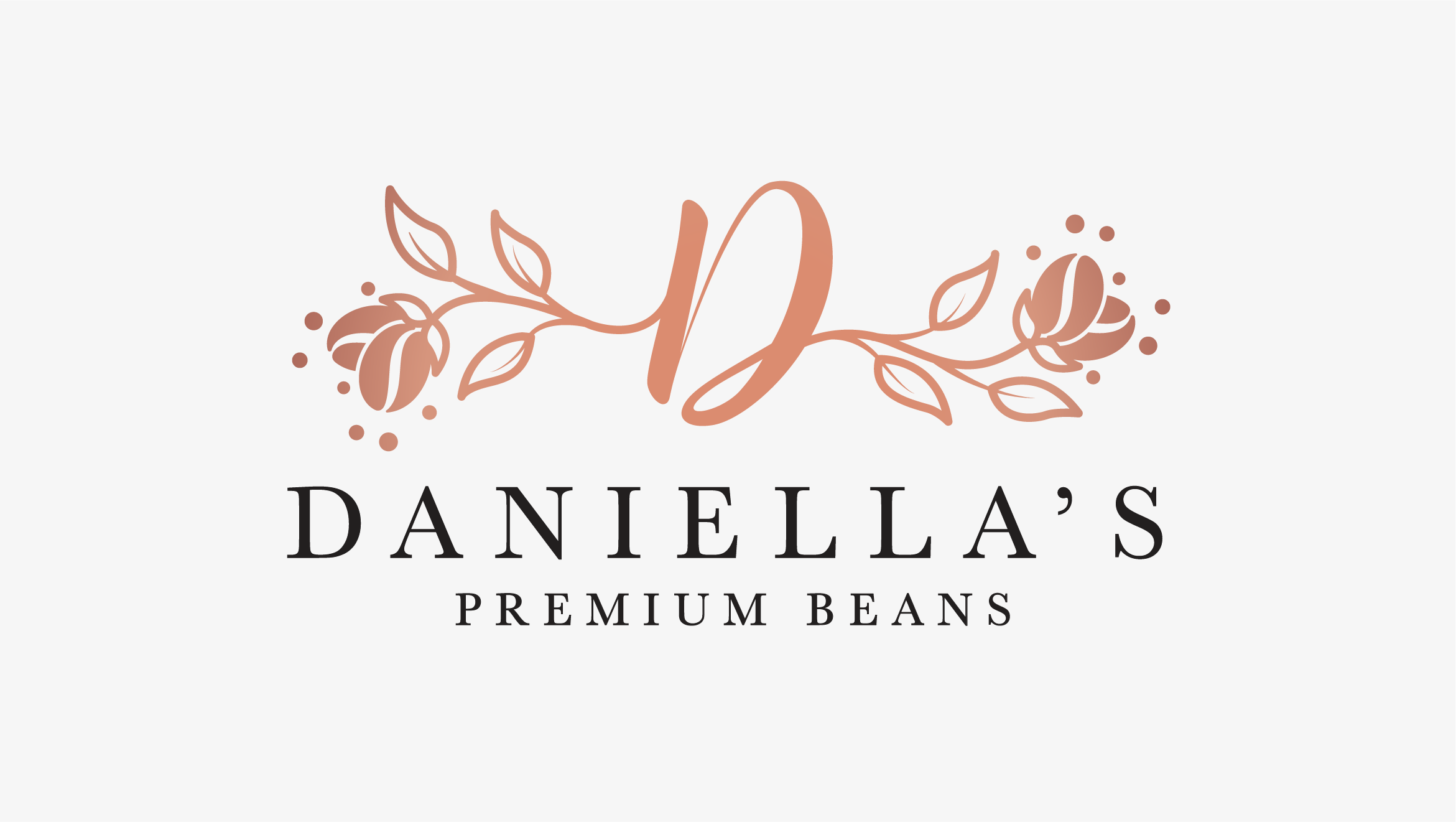
Daniella's Premium Beans
Daniella’s Premium Beans is more than just coffee—it’s a refined experience for those who appreciate quality, craftsmanship, and rich, full-bodied flavour. Rooted in sophistication and a passion for the perfect brew, this brand blends timeless elegance with modern appeal.
Daniella’s Premium Beans boasts an elegant visual identity, with a logo that often features a stylised “D” intertwined with floral elements, conveying sophistication and natural quality. A warm, earthy colour palette, including various shades of brown and peach, is used to create a sense of comfort and indulgence. The typography combines classic fonts like Baskerville with modern sans-serif options, striking a balance between tradition and contemporary appeal.
Brand Identity & Stationary
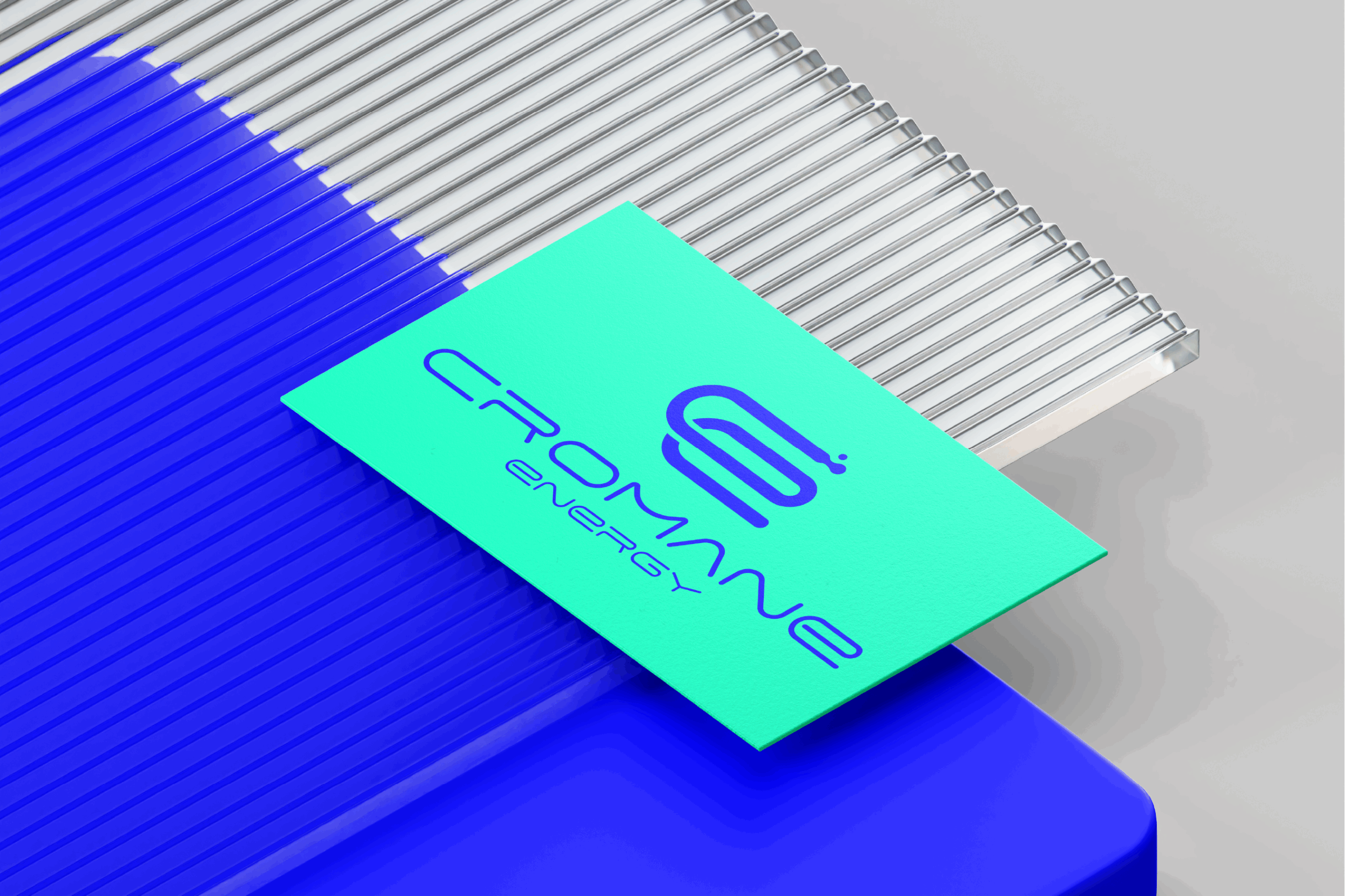
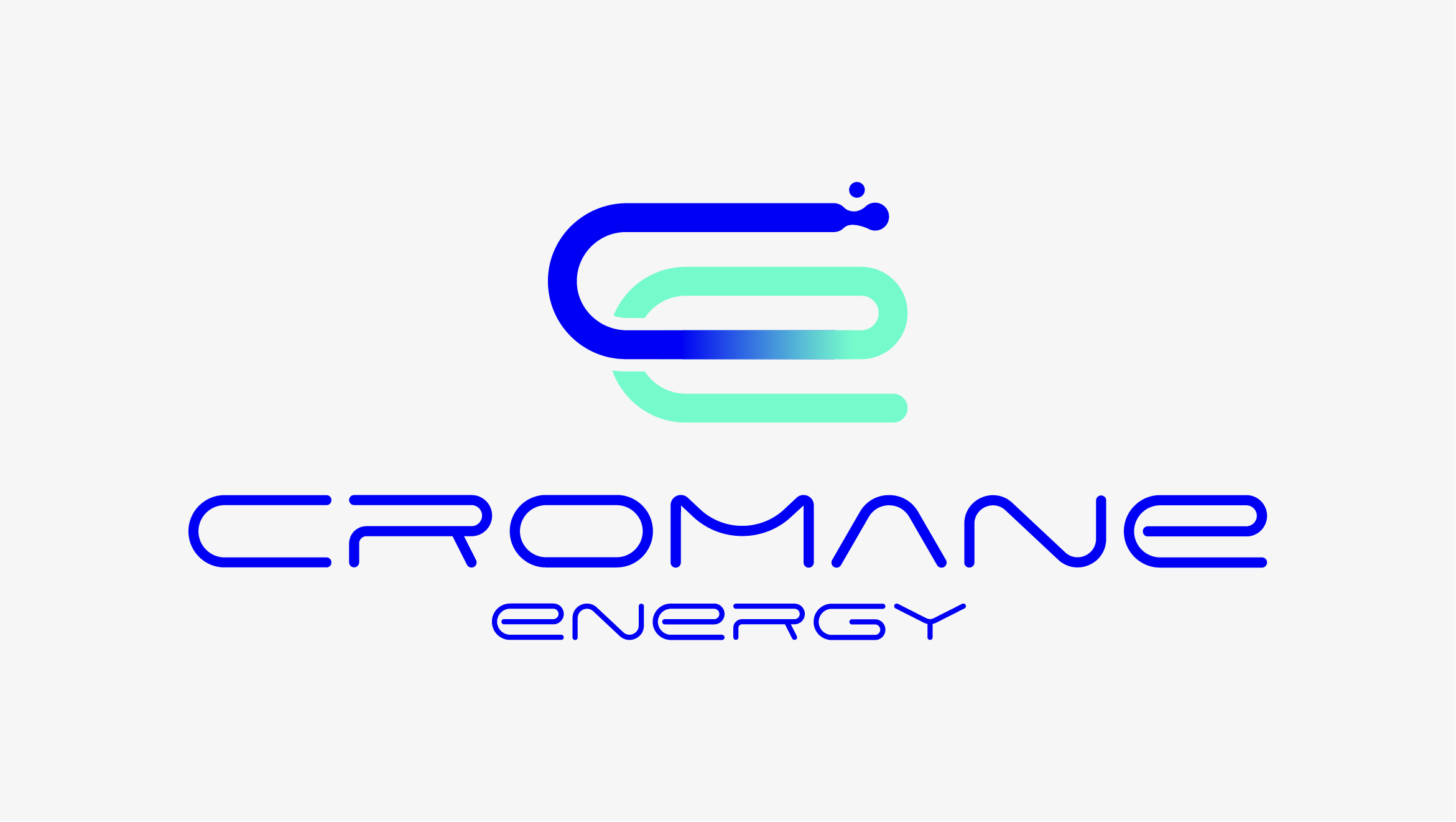
Cromane Energy
Cromane Energy is a premier bulk diesel supplier and truck stop service provider, dedicated to ensuring seamless fuel supply for logistics companies, fleet operators, and long-haul drivers. The company focuses on reliability, innovation, and customer-centric service to create a superior refuelling experience.
The visual identity of Cromane Energy reflects its commitment to reliability and efficiency. It likely features bold typography and colors that evoke trust while conveying dynamism through modern design elements. This visual presence reassures customers of operational excellence while highlighting innovation in logistics. The overall design aims to convey professionalism with a forward-thinking approach.
Brand Identity, Stationary & Website
Dashco Group Services
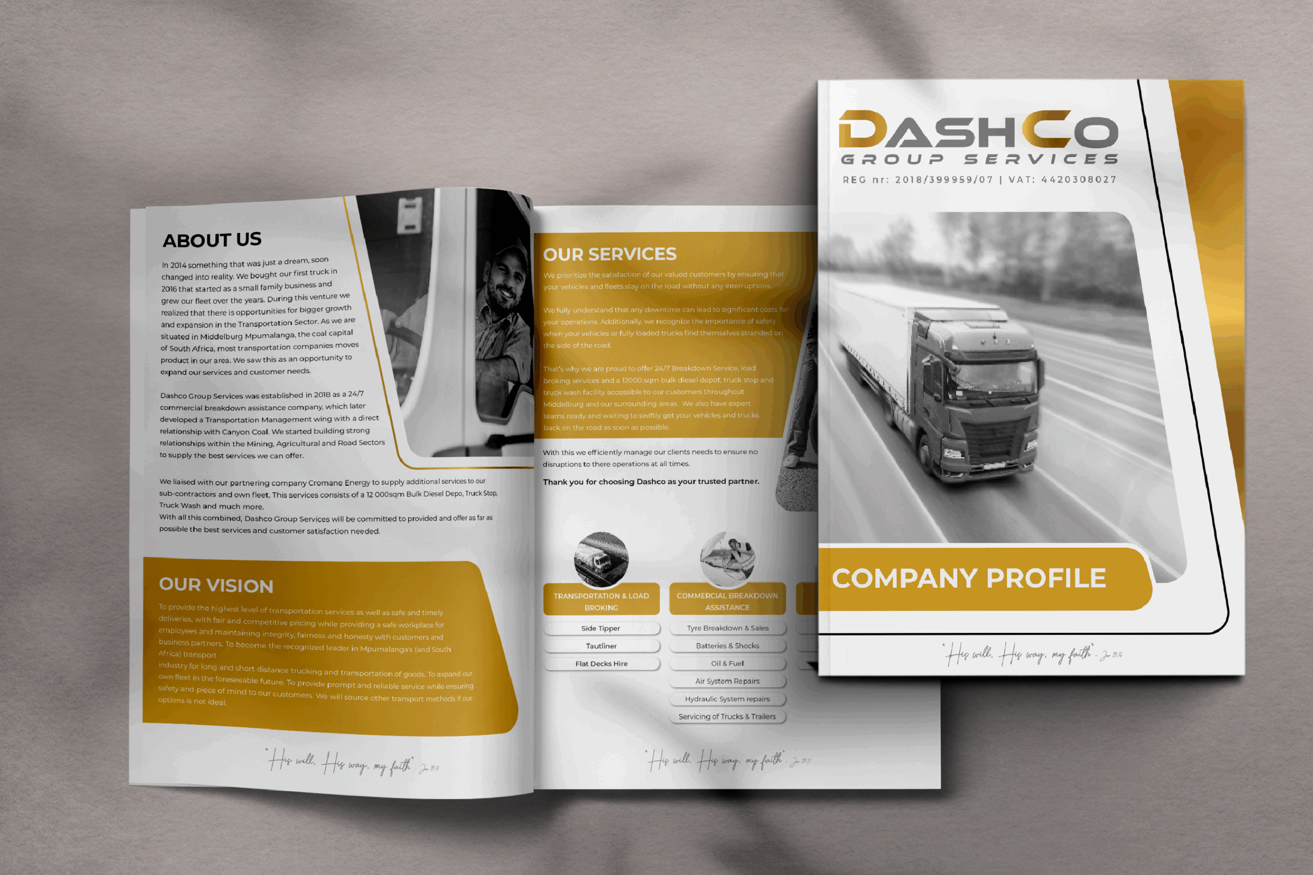
Dashco Group Services is a logistics powerhouse specialising in transportation, load broking, and commercial breakdown assistance. With a strong focus on reliability and efficiency, Dashco ensures seamless freight movement while providing essential support services to keep commercial fleets operational.
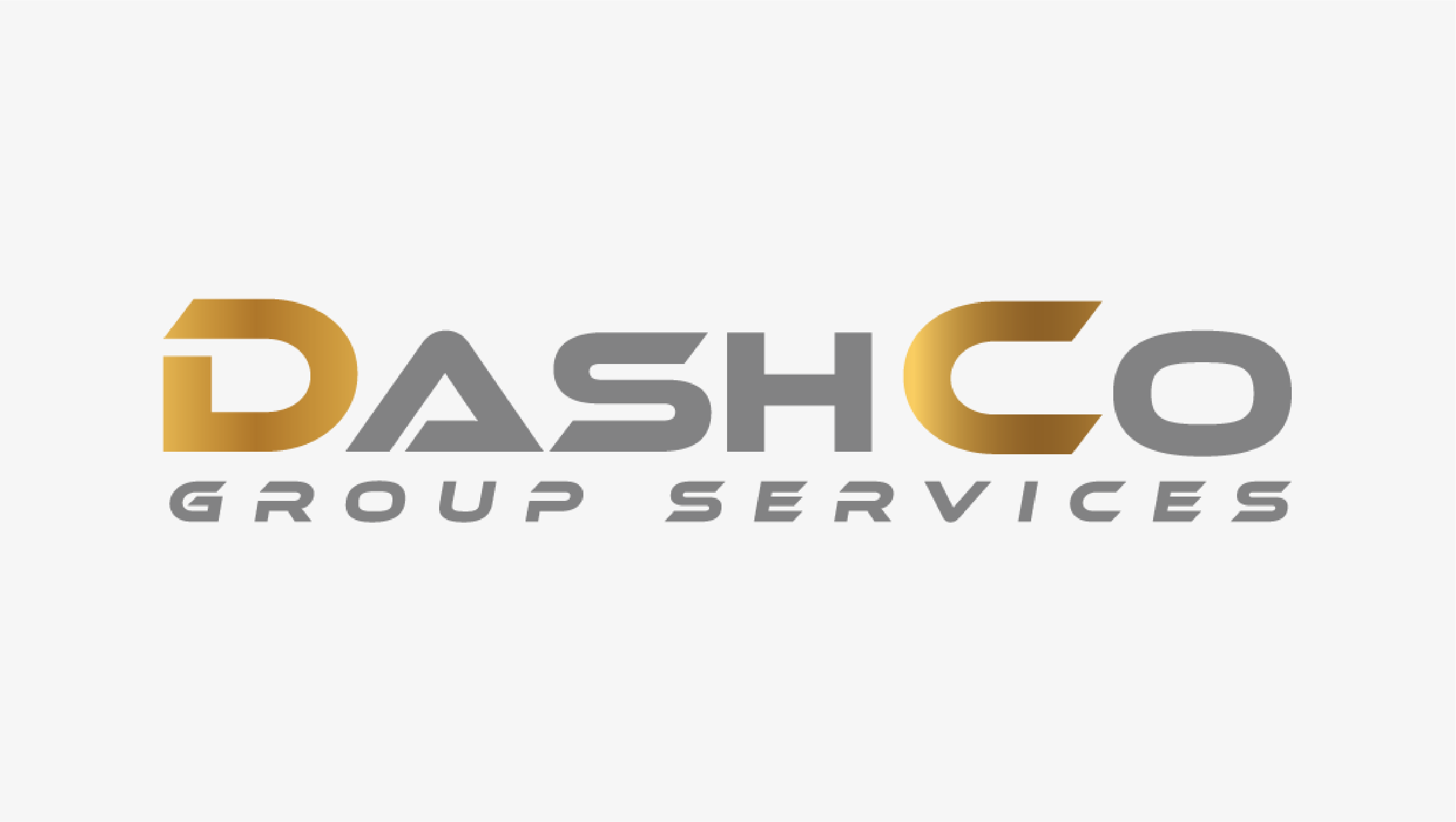
Dashco’s brand identity is bold, modern, and authoritative, reflecting its industry leadership. The logo features strong, industrial-style typography using the Montserrat typeface, with a sleek combination of state blue, antique gold, and off-white, conveying professionalism and trust. This identity is consistently applied across fleet vehicles, uniforms and stationery to ensure it remains highly recognisable.
Brand Identity & Website
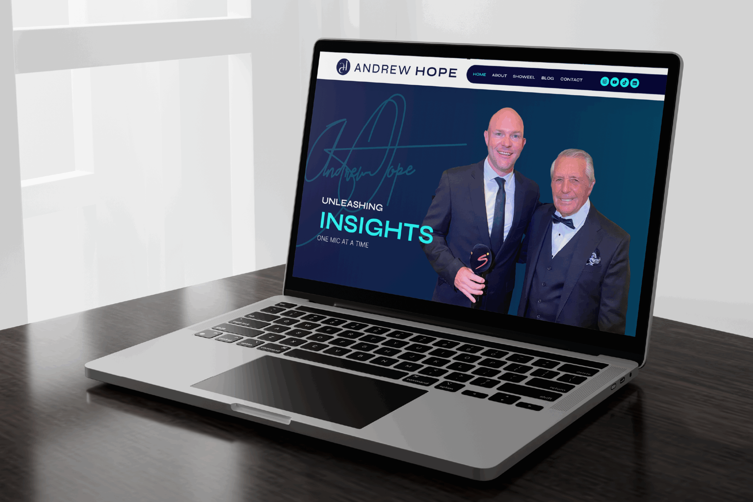
Andrew Hope
Brand Identity & Website
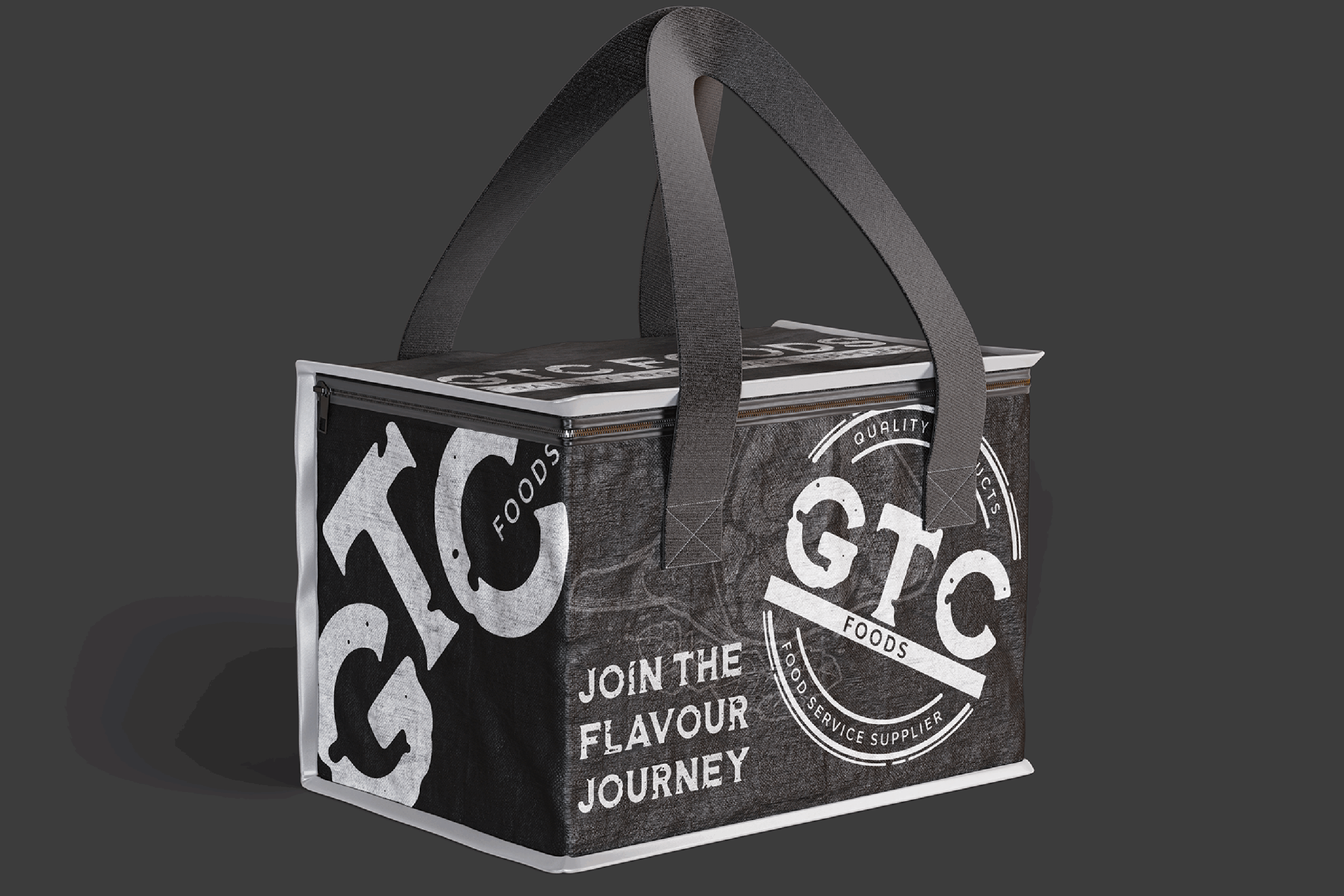
GTC Foods
Brand Identity & Stationary
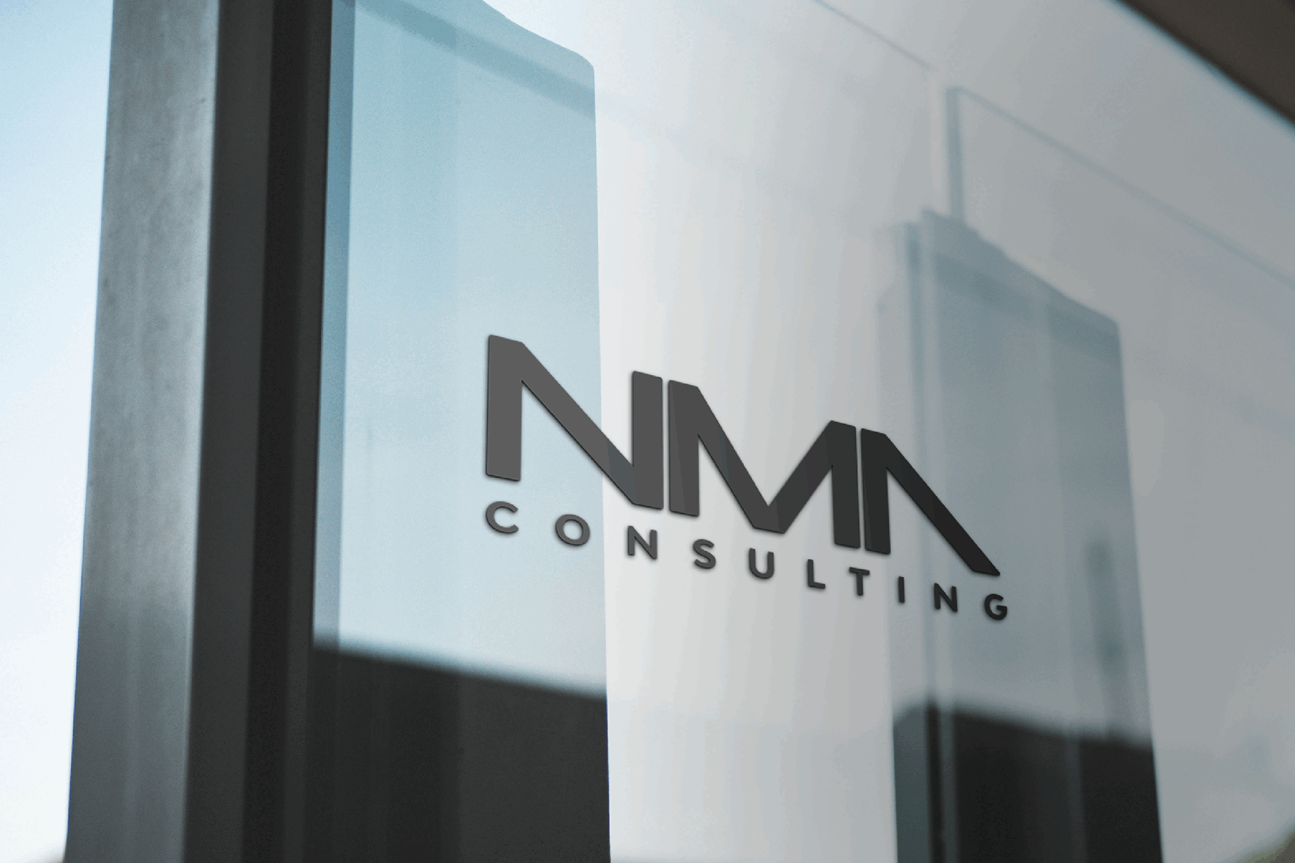
NMA Consulting
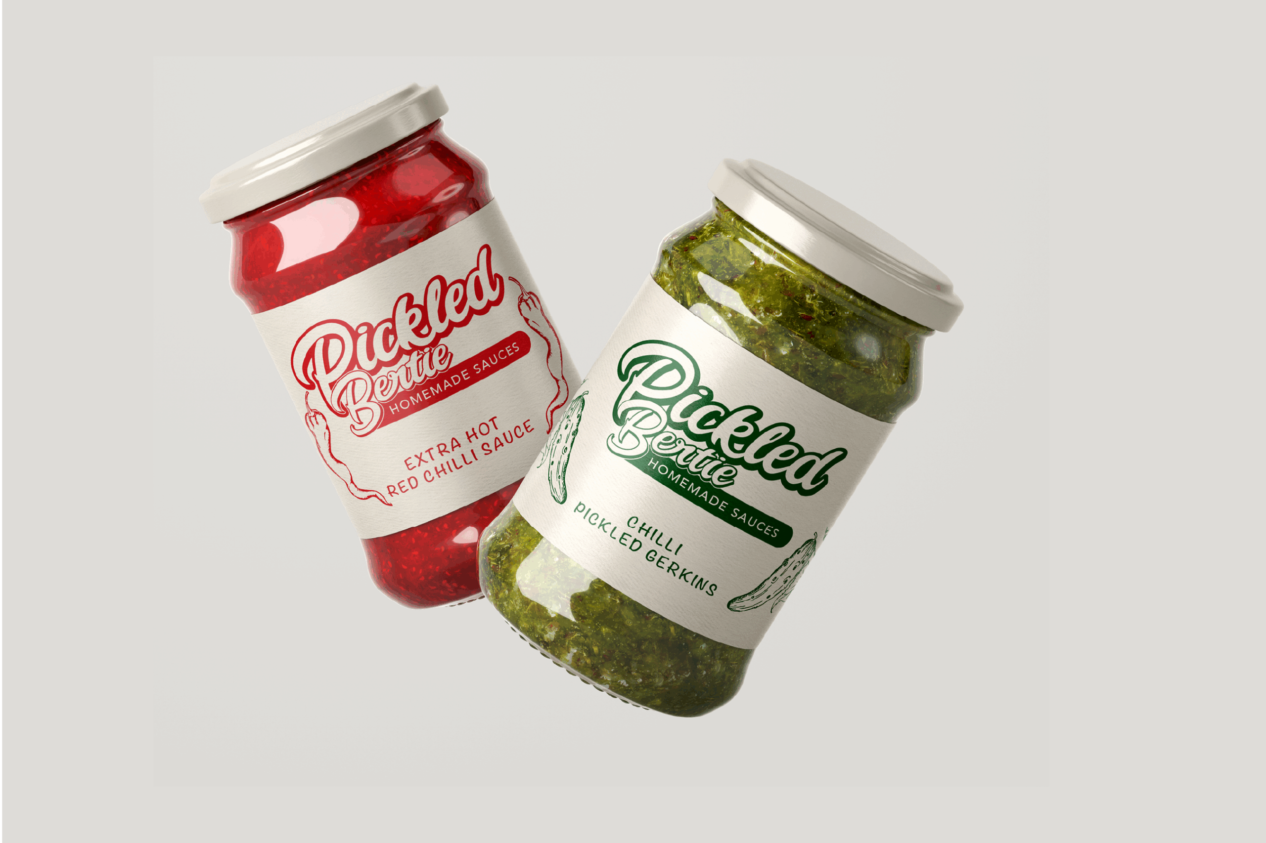
Pickled Bertie is a brand that brings homemade sauces and pickled foods to life with a punch of flavour and personality. Rooted in tradition yet full of character, Pickled Bertie is all about bold, handcrafted goodness that excites the taste buds.
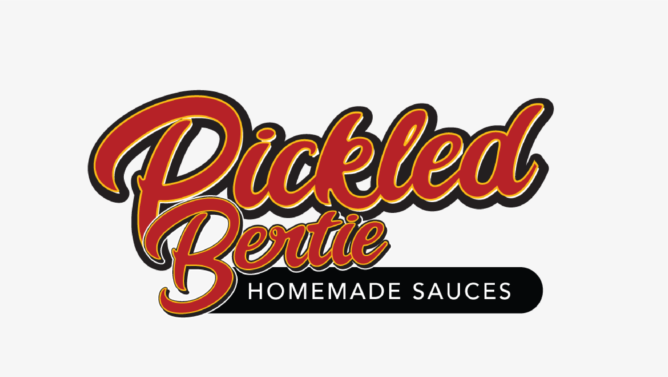
Pickled Bertie’s visual identity captures its playful and rustic spirit through a vintage-style script logo. The colour palette features deep reds, golden yellows, and charcoal blacks to reflect the richness and warmth of Bertie’s flavour-packed creations. With hand-drawn typography and textured elements, it enhances the homemade, small-batch appeal, to make it feel authentic.
Brand Identity & Packaging
Pickled Bertie Homemade Sauces
Pickled Bertie is a brand that brings homemade sauces and pickled foods to life with a punch of flavour and personality. Rooted in tradition yet full of character, Pickled Bertie is all about bold, handcrafted goodness that excites the taste buds.
Pickled Bertie’s visual identity captures its playful and rustic spirit through a vintage-style script logo. The colour palette features deep reds, golden yellows, and charcoal blacks to reflect the richness and warmth of Bertie’s flavour-packed creations. With hand-drawn typography and textured elements, it enhances the homemade, small-batch appeal, to make it feel authentic.
Brand Identity, Website & Apparel Design
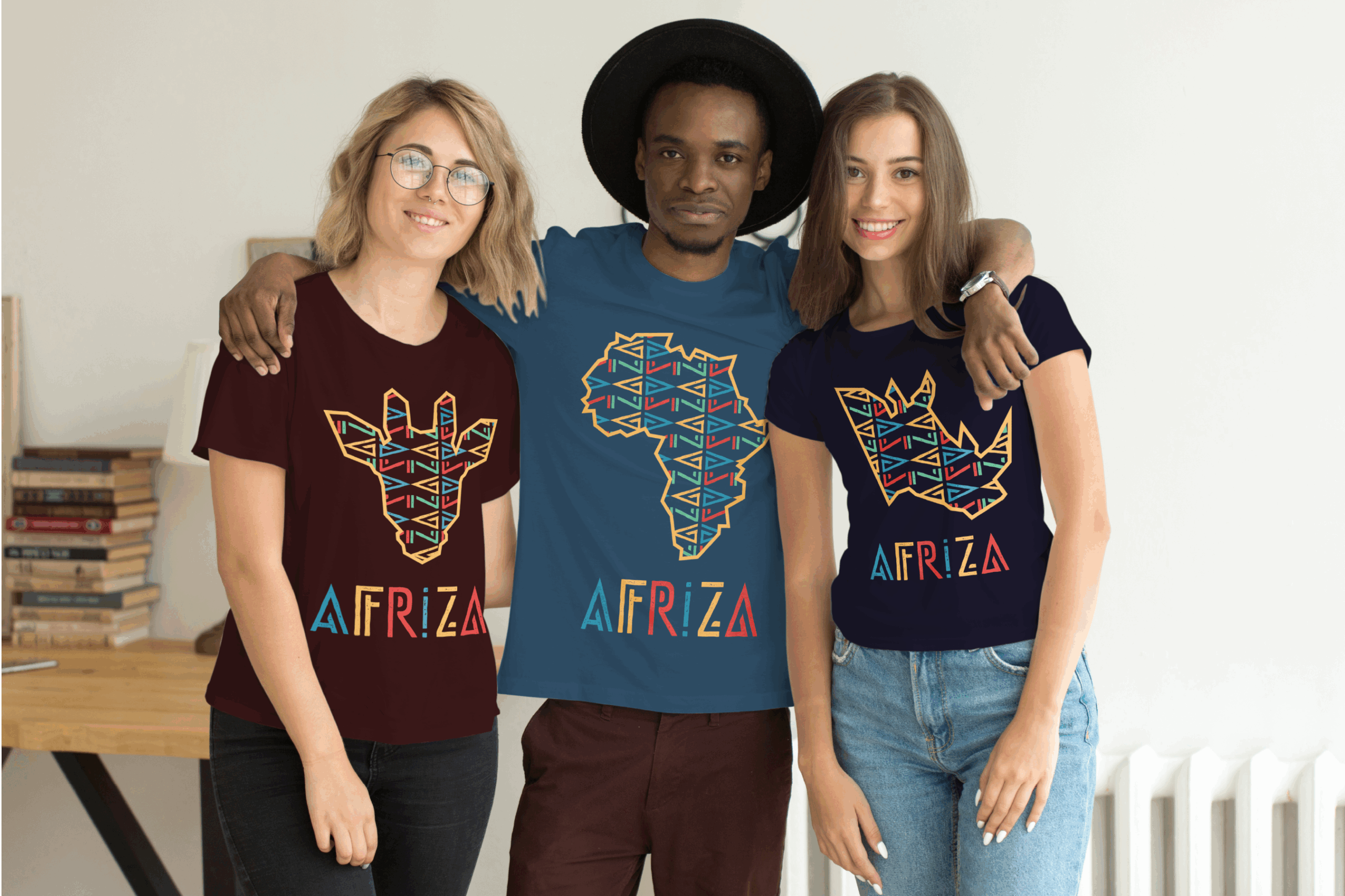
AfriZA Apparel
Making an IMPACT for our clients
TESTIMONIALS
Book a Call
Ready to elevate your brand with a strategic and impactful approach? Let’s chat! Whether you need a brand refresh or a complete transformation, I’ll help you gain clarity, confidence, and a brand identity that truly reflects your business.
Book your free discovery call today and let’s make an IMPACT together!
Copyright © 2026 Lady Muse. All Rights Reserved